
A 20×30 frame is a sweet spot in wall art big enough to make a statement, yet versatile enough for apartments, offices, and gallery walls. Whether you’re framing a travel poster, a wedding portrait, or a minimalist print, understanding the specifics of this size will save you from common pitfalls like awkward cropping, glare, or sagging mounts. Here’s a human-friendly, detail-rich guide to help you nail the look the first time.
1) What Exactly Is a 20×30 Frame?
Let’s get the dimensions straight and practical:
-
Outside naming, inside reality: “20×30” refers to the inner fit size for the artwork or mat—20 inches by 30 inches. In metric, that’s 50.8 × 76.2 cm.
-
Aspect ratio: 20×30 reduces to 2:3, the same ratio as many camera sensors and classic 4×6 photos scaled up. That’s why 20×30 is so popular for photography prints—no weird cropping if you shot in 2:3.
-
Area & presence: At 600 square inches (≈ 4.17 sq ft), it’s a true feature size—prominent over a console table, bed, or sofa end, but not overpowering a modest wall.
-
Orientation: Works portrait (vertical) or landscape (horizontal). Flip the hardware or request dual-hanging hardware for flexibility.
Good to know: If your image isn’t 2:3 (say, it’s a square or 4:5 crop), a mat or float mount is your best friend to avoid cutting off important details.
2) Print File Prep: Resolution, Cropping & Color That Pops
Framing starts long before the frame—get the print right and everything downstream gets easier.
Target pixel dimensions (no guesswork):
-
300 dpi (exhibition quality): 20 in × 300 = 6000 px; 30 in × 300 = 9000 px → 6000×9000 px
-
240 dpi (high quality): 4800×7200 px
-
150 dpi (viewing distance OK): 3000×4500 px (acceptable for posters viewed from several feet away)
Cropping & bleed:
-
A 20×30 print in a 2:3 ratio should drop in perfectly.
-
If you’re using a mat, the mat opening is usually cut slightly smaller than the print so it overlaps the edges and holds it flat. Example: A 20×30 print works with a mat opening around 19.5×29.5 inches, giving ~¼″ overlap on each side.
Color management tips:
-
Convert to sRGB for most labs and online printers unless they specify a custom profile.
-
Bump midtone contrast gently to counteract the slight loss of punch behind glazing.
-
Mind the shadows—prints can look darker under glass; lifting deep shadows a bit can help.
Paper finishes:
-
Luster/Satin: Balanced glare control + vibrant color. A great default.
-
Matte/Fine Art Rag: Softer contrast, gallery vibe, minimal glare.
-
Glossy/Metallic: Ultra-pop and depth; best when glare is controlled (non-glare glazing, indirect light).
3) Mats, Margins, and Mounting: How to Frame Like a Pro
The mat isn’t just decorative; it’s a functional spacer that protects the print from touching the glazing.
Popular mat strategies with a 20×30 frame:
-
No mat (edge-to-edge): The bold, poster-style look. Use spacers if you skip the mat so the print doesn’t press against the glazing.
-
Single mat: Clean, classic. For a 20×30 frame that holds a 16×24 print (also 2:3), you’ll get a pleasing border all around (the mat window typically ~15.5×23.5 to overlap the print).
-
Double mat: A second, thinner mat reveals a narrow color accent line—great for pulling a color from the artwork.
-
Float mount: Elevates the print slightly above the backing with visible edges—modern, airy, and perfect for deckled papers.
Mounting options:
-
Hinge-mount with archival tape: Conservator favorite for paper prints. Removable, minimal contact.
-
Dry mount (heat-activated adhesive): Super flat, professional look, but less reversible—choose archival materials and understand it’s more permanent.
-
Foam or gator board backing (acid-free): Prevents warping; choose acid-free to protect the print over time.
Depth matters:
Check the rabbet depth (the frame’s interior depth). If you’re using a thick mat + spacers + backing + glazing, ensure the frame can handle the stack without bowing.
4) Glazing 101: Glass vs. Acrylic (and Why It Matters)
Glazing protects your print. Pick based on display conditions and priorities.
Glass:
-
Standard clear glass: Economical, crisp, but can glare.
-
Non-glare glass (etched): Diffuses reflections; slight softness in fine detail.
-
UV-protective glass: Filters damaging light, slows fading.
-
Museum glass: Top-tier clarity + anti-reflection + UV protection. Stunning, but premium-priced.
Acrylic (Plexi):
-
Lightweight, shatter-resistant: Ideal for larger pieces and high-traffic areas.
-
UV-blocking acrylic: Protects color longevity.
-
Abrasion-resistant varieties: Less prone to hairline scratches.
-
Note: Can carry static—fine art printers often recommend care with delicate media.
Quick chooser:
-
Kids rooms, stairways, or shipping long-distance? Acrylic.
-
Critical sharpness under controlled lighting? Low-reflection glass or museum glazing.
-
Budget with decent performance? Standard glass + careful placement to minimize glare.
5) Frame Styles & Materials: From Minimal to Statement
A 20×30 frame plays nicely with many aesthetics; just match frame personality to the artwork and room.
Frame materials:
-
Solid wood (oak, walnut, maple): Warm, natural grain; upscale feel.
-
Engineered wood (MDF with veneer): Cost-effective, consistent finish.
-
Metal (aluminum profiles): Slim, modern, strong; black, silver, champagne, and white are classics.
Profiles & finishes:
-
Slim gallery frame: ¾″–1″ face, crisp and modern.
-
Chunky profile: Adds visual weight; balances bold posters or expansive walls.
-
Floater frame (for canvas): Reveals a gap around the edges—elegant for canvas or mounted panels.
-
Color cues:
-
Black: Graphic, contemporary, anchor for high-contrast art.
-
White: Airy, minimalist; fades into light walls.
-
Natural wood: Organic warmth; perfect for interiors with earth tones, textiles, plants.
-
Metallics (gold/bronze): Sophisticated accent; great with vintage photography or portraiture.
-
6) Where a 20×30 Shines: Placement, Height & Pairings
Hanging height (gallery rule):
Aim for the center of the art at 57 inches from the floor (the typical eye-level standard). For a 30″ tall piece, the top lands around 72 inches from the floor—refine a bit for furniture heights or tall occupants.
Room-by-room ideas:
-
Living room: Over a console or sideboard; pair two 20×30 frames side-by-side for symmetry.
-
Bedroom: One centered above a dresser; two stacked vertically where ceilings are tall.
-
Hallway: A linear series—three in a row creates a sleek gallery.
-
Home office: One strong 20×30 behind the desk minimizes visual noise but adds presence.
Spacing when pairing:
-
Side-by-side: 2–3 inches between frames keeps the sightline cohesive.
-
Grid walls: Keep gaps consistent; a laser level is your secret weapon.
Lighting tips:
-
Avoid direct sunlight when possible.
-
Add picture lights or track lighting at a 30° angle to reduce glare and lift detail.
-
If glare is unavoidable, consider anti-reflective glazing.
7) Common Use Cases (and How to Get Them Right)
Photography enlargements:
If your camera shoots 2:3 (most DSLRs and many mirrorless), a 20×30 is a clean enlargement without cropping. Soft images? Upscale with care and consider 240 dpi—balance sharpness with viewing distance.
Posters & typographic prints:
Go borderless for punch, or add a 2–4 inch mat for a gallery vibe. Bold posters love black or aluminum frames; typographic pieces shine in white or natural wood.
Fine art & illustrations:
Archival paper + cotton rag mat + UV glazing makes a museum-grade combo. A float mount shows off deckled edges beautifully.
Canvas & panel art:
Use a floater frame sized to fit a 20×30 canvas. No glazing needed; a good varnish protects the surface.
8) Practical Buying Checklist (Save This!)
-
Confirm ratio: Is your art 2:3? If not, plan a mat or crop.
-
Choose glazing wisely: Glass vs. acrylic; standard vs. UV vs. anti-reflective.
-
Mind the depth: Ensure the frame’s rabbet fits your mat + backing + glazing stack.
-
Use acid-free everything: Mat, backing, hinges—archival materials prolong life.
-
Add spacers if matless: Keep the print off the glazing.
-
Hanging hardware: D-rings + wire for larger frames; wall anchors for plaster/drywall.
-
Protect corners: During transport, keep corner protectors on and carry upright.
9) Styling Ideas: Make It Yours
-
Monochrome photo + black metal frame + white mat: Timeless gallery chic.
-
Pastel art + natural oak + off-white mat: Soft, Scandinavian warmth.
-
Bold color print + white frame (no mat): Clean, contemporary pop.
-
Vintage poster + walnut frame + museum glass: Rich, collector feel.
-
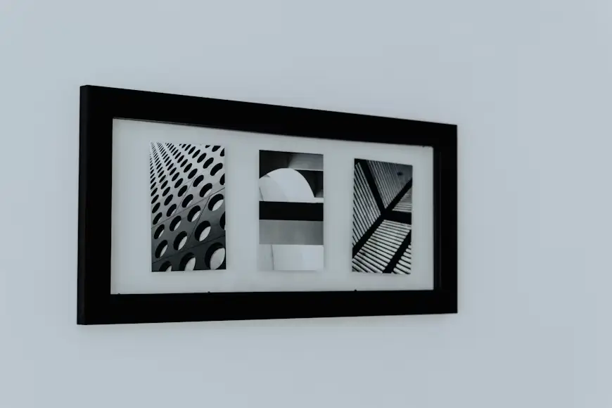
Triptych look: Three related 20×30 frames in a row—tight spacing, consistent mats, unified frames.
10) Quick Troubleshooting
-
Print doesn’t fit the mat opening: Mat windows are smaller by design. If too tight, ask for a slightly larger cut (still allow ⅛–¼″ overlap).
-
Wavy print (cockling): Humidity or insufficient mounting. Consider hinge-mounting with more hinge support, or dry mount for absolute flatness (accepting lower reversibility).
-
Glare city: Move the piece, change the angle, or swap to anti-reflective glazing.
-
Dust under glass: Clean with a microfiber and compressed air in a low-dust area; reassemble carefully.
You might also like: Stolen Lamb Wilmslow – Menu, Prices & Opening Times
FAQs
-
Is 20×30 standard? Yes—widely supported by printers and frame shops.
-
Best resolution? 6000×9000 px (300 dpi) for critical detail; 4800×7200 px is a strong alternative.
-
Can I use A-series paper? A1/A2 won’t match 2:3; you’ll need matting or trimming.
-
How heavy will it be? Depends on frame material and glazing; large glass can be hefty—use proper wall anchors.
-
Do I need a mat? Not required, but mats add breathing room and protect the print from glazing contact.
Conclusion
A 20×30 frame is that perfect middleweight: substantial, sophisticated, and adaptable. Get the ratio right, respect archival practices, pick glazing for your light conditions, and hang at a considered eye level. Do that, and your art won’t just sit on the wall; it’ll live there, drawing eyes and telling your story every time you pass by.